Better English
-
Avoid frequent repitition of words or phrases. To specify a rotation, the rotation axis and angle are not enough; the sense of rotation must be specified. can be expressed better by writing A rotation must be specified by an axis-angle pair and the sense of the operation.
-
Avoid being personal. Let us look at an example....is expressed better as Consider an example.... The phrase We can also use a single row...can be written A single row.... can also be used
-
Text making an excessive use of abbreviations lacks clarity. Similarly, limit the use of brackets.
-
Limit the use of adjectives such as very, extremely, highly ...
-
"The aim of this Section was ..." is not strictly the correct expression of what you intend to say. "The aim of the work presented in this Section was..."
Common Mistakes
- No excuse for spelling mistakes - use SPELLCHECK . Use either English or American but not both.
- Inconsistency of notation. The article must share a common terminology, best ensured by using a nomenclature list.
- There should be a gap after a full stop or a comma. Accredited abbreviations found in the Oxford English Dictionary (such as Ph.D.) do not have gaps after full stops; initials in names must be separated by spaces (A. N. Other).
- There are no spaces after an opening bracket or before a closing bracket
- Include titles in the reference list.
- Inadequate referencing.
- Left quotation marks are not the same as right quotation in TeX.
- There is a thin-space between numerals and units (e.g. 45 MPa). The units themselves are in roman font. Use strict SI convention. For example, there is a gap between MN and mm when writing MN mm. Use exponents: MN mm -1 rather than MN/mm
- Incorrect or unspecified units of concentration: Fe-10Ni % is not good enough. e.g., use Fe-10Ni wt%.
- Experiments are reported in the past tense. For example, length changes were analysed.
- Abbreviations must be explained when first introduced (HAZ, TTT ?!).
- Fig. 4.2 not Fig.4.2; Table 5.1 not Table.5.1
- Terms like "Fig. 4.2" should be on the same line
- "Compared with" rather than "Compared to".
- Plural of Datum is Data. These data are excellent....
- PROGRAMME of work as opposed to computer PROGRAM
- Names of chemical elements do not begin with capitals unless at the beginning of a sentence.
- All equations, tables, figures must be numbered.
- Figures must not be excessively large, and should be included in the text rather than at the end of the article. The font on scales and legends should be at least size 15 (Geneva) when the figure size is 1/3 of the page length.
- It is wrong to write a volume fraction as 20%. The latter is a volume percent.
- Mathematical notation is in italics whether it occurs in the text or in equations. Terms such as log, exp, sin are nevertheless in roman font even when in equations. Mathematical notation in figures should be the same as in the text.
- When presenting the results of computer programs, it is important to specify completely the inputs used to generate the outputs. For example, it is dangerous to present a calculated phase diagram without specifying all the phases and components accounted for in the analysis.
- 'software' is plural. Avoid using 'softwares'.
- 'previous works' should similarly read 'previous work' even when referring to several pieces of work.
Figures and Tables
The notation on figures must correspond to that used in the text. There must not be information on figures which is not discussed in the text. Units on diagrams must be SI. Old diagrams with non-SI units are best redrawn. Any diagrams obtained from the literature must be acknowledged even though they may have been redrawn, especially if the intellectual content of the diagram is not significantly modified. Quantities plotted are dimensionless, so they should be divided by the units on the axis legends (e.g., distance / m). An example illustrating all the features is given below. In that figure, S Vis a surface per unit volume. ε iis a length.
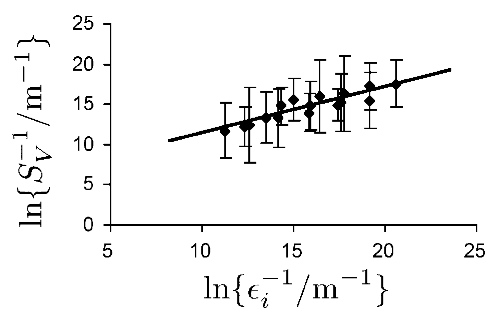
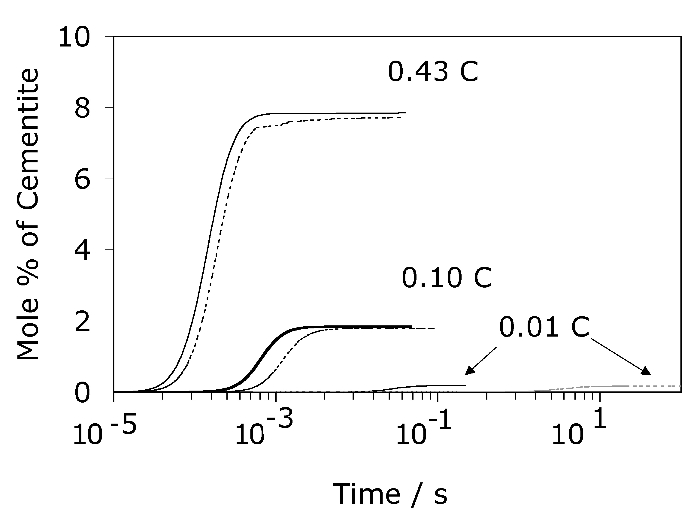
Avoid using avoid keys since the reader has to look at the key and then identify the relevant curve. Similarly, avoid using minor ticks in diagrams unless it is necessary to indicate precision; minor ticks are useful in logarithmic scales where nonlinearity can otherwise cause difficulties in immediate interpretation. Note also the horizontal scale in the following diagram. Do not use "1E-5" but rather, 10 -5. In the original article, the caption to the figure explains the difference between the dashed and continuous lines.
Columns in tables should not be separated by vertical lines. The recommended practice is to omit such lines for clarity: